04
Visual Identity
Our visual identity reinforces safety, trust, and calm confidence. It is designed to feel timeless, grounded, and human, avoiding trends that create noise or urgency.
Every visual decision should support clarity and reassurance rather than demand attention.
Contents
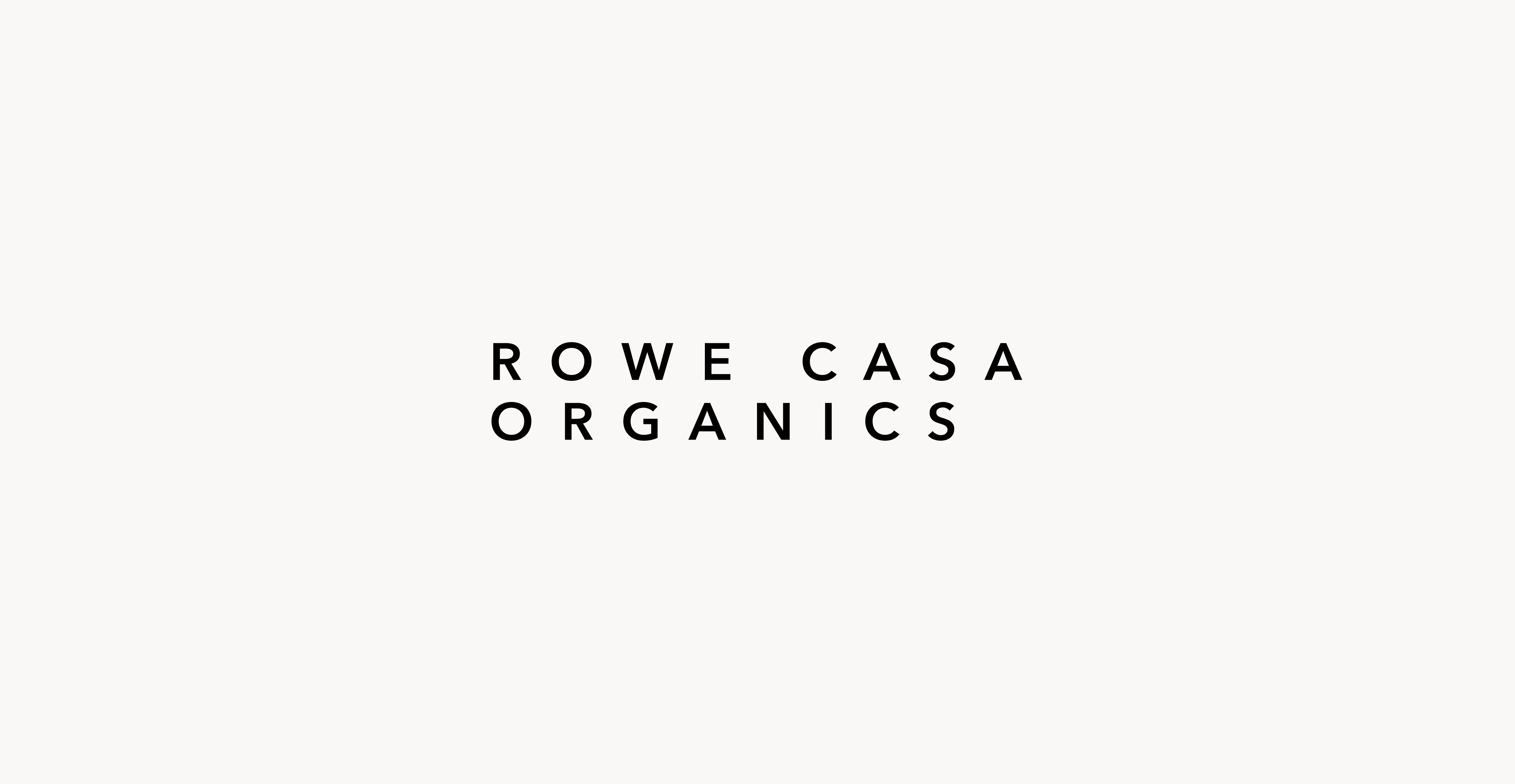
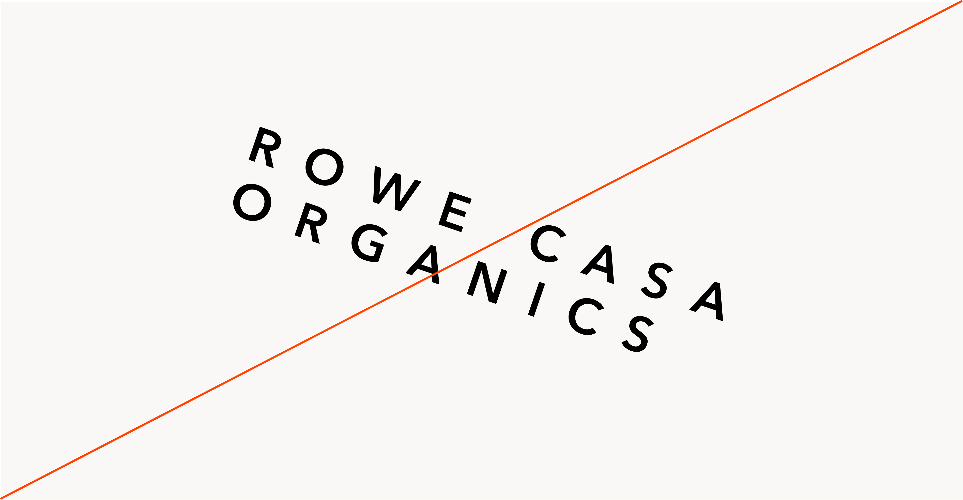
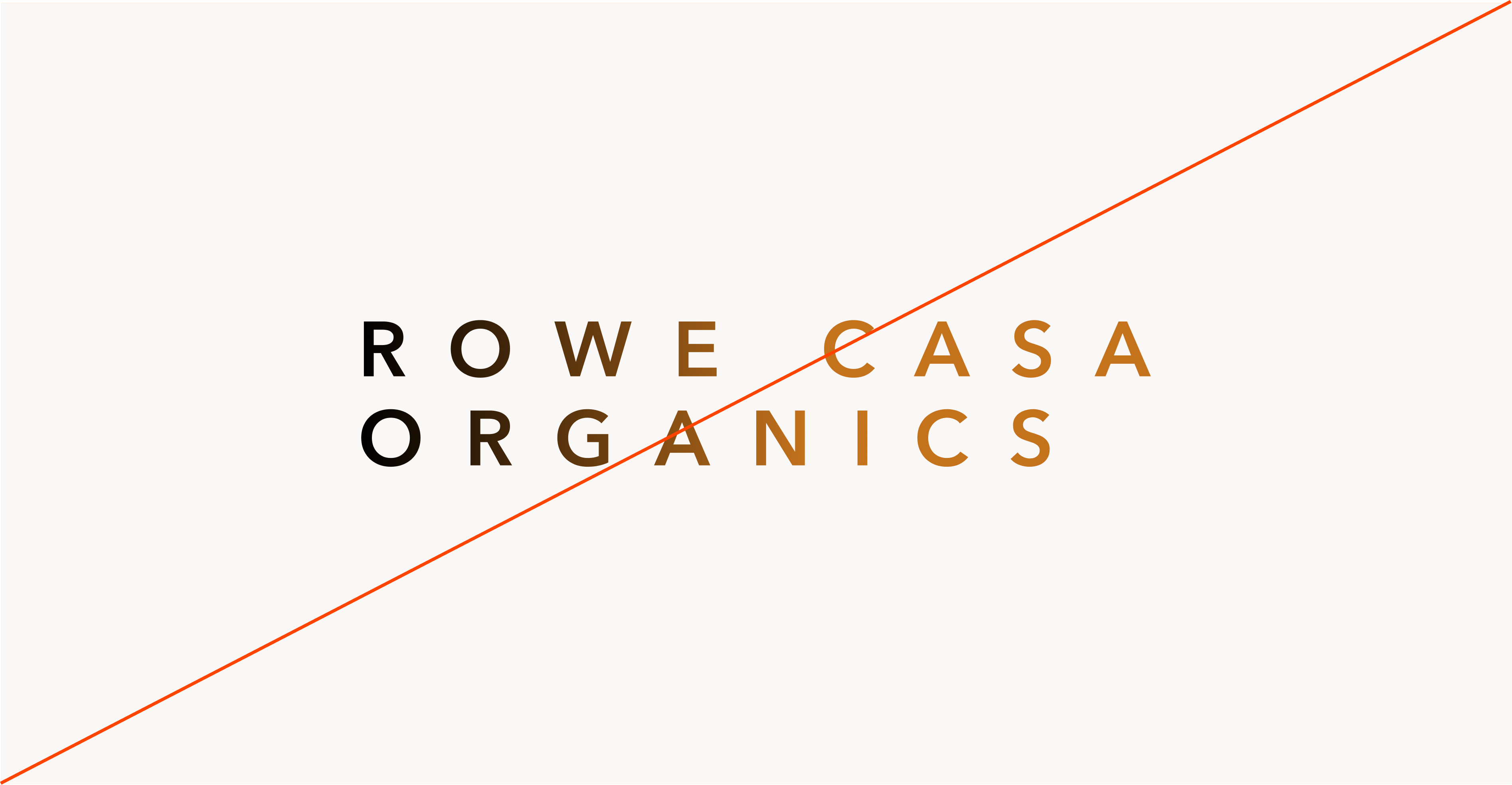
Logo
The logo is our primary identifier. It contains both our symbol and our name in the wordmark. It should be used most often to represent our brand, especially to an unfamiliar audience.
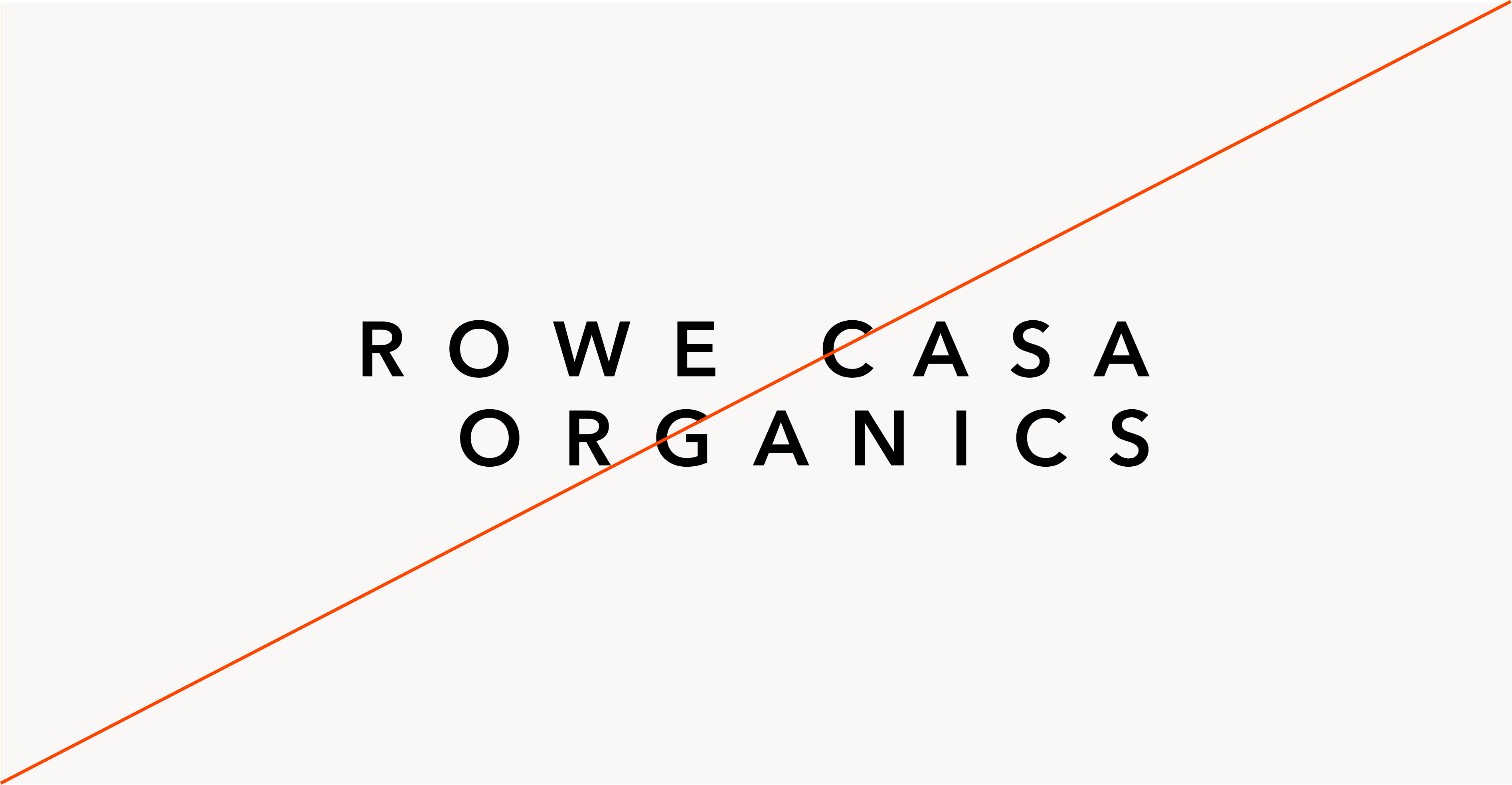
Primary Lockup
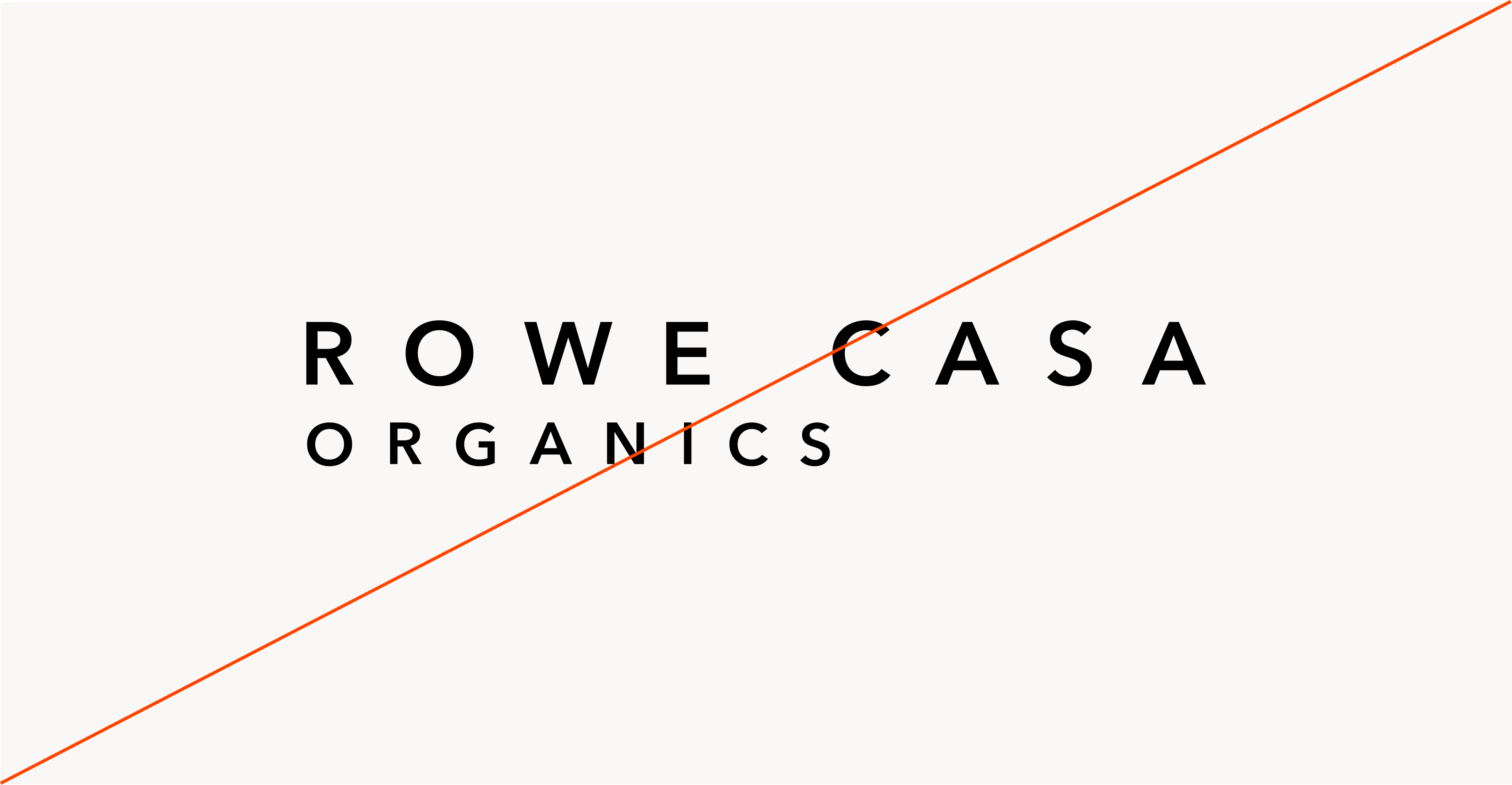
Clearspace


a / 2

whitespace (A/3)


a

a / 2
whitespace (A/3)
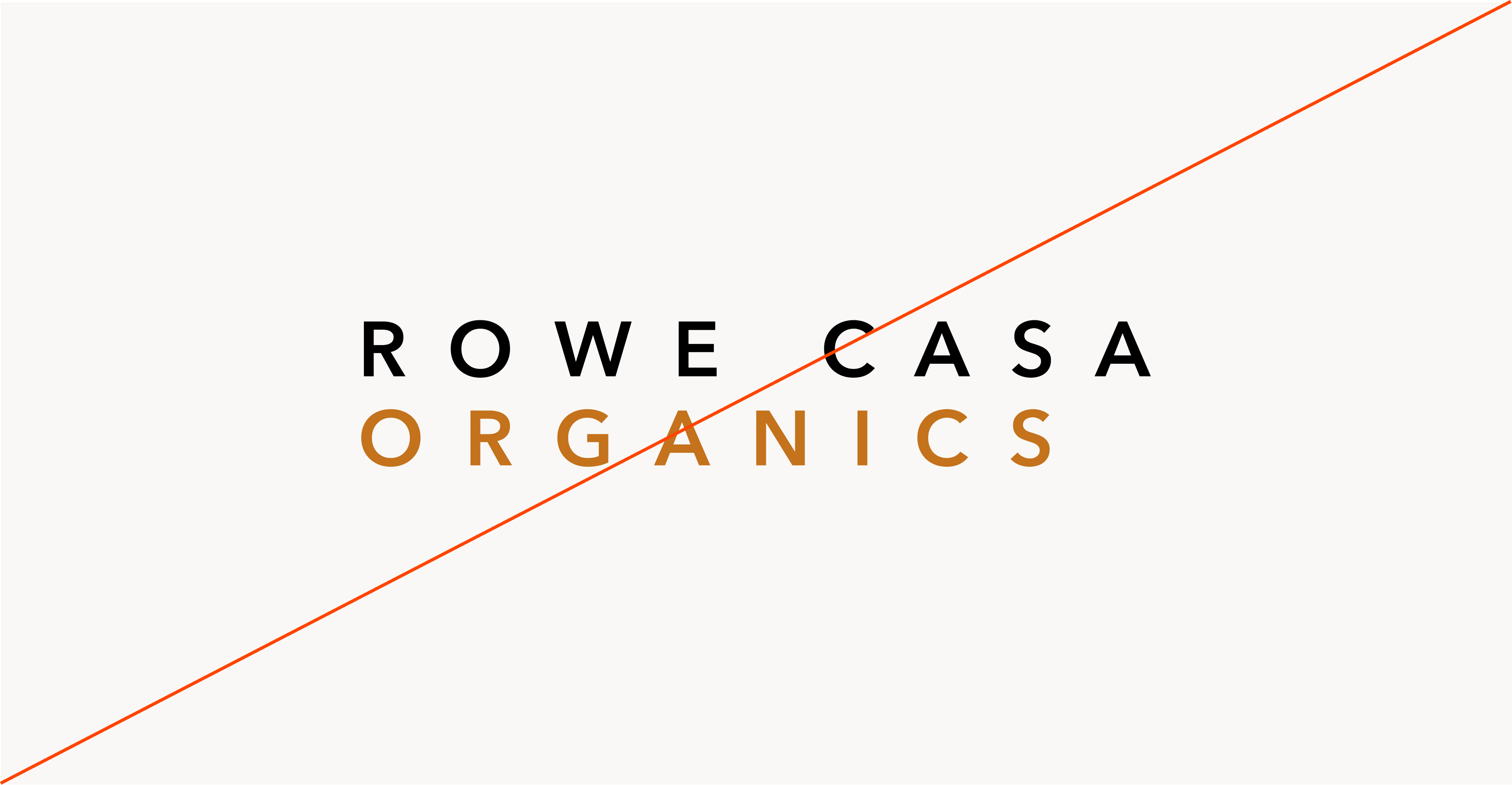
Secondary Lockups
Incorrect Usage

Do not resize the mark
Do not rotate the logo
Do not change the color of the mark alone
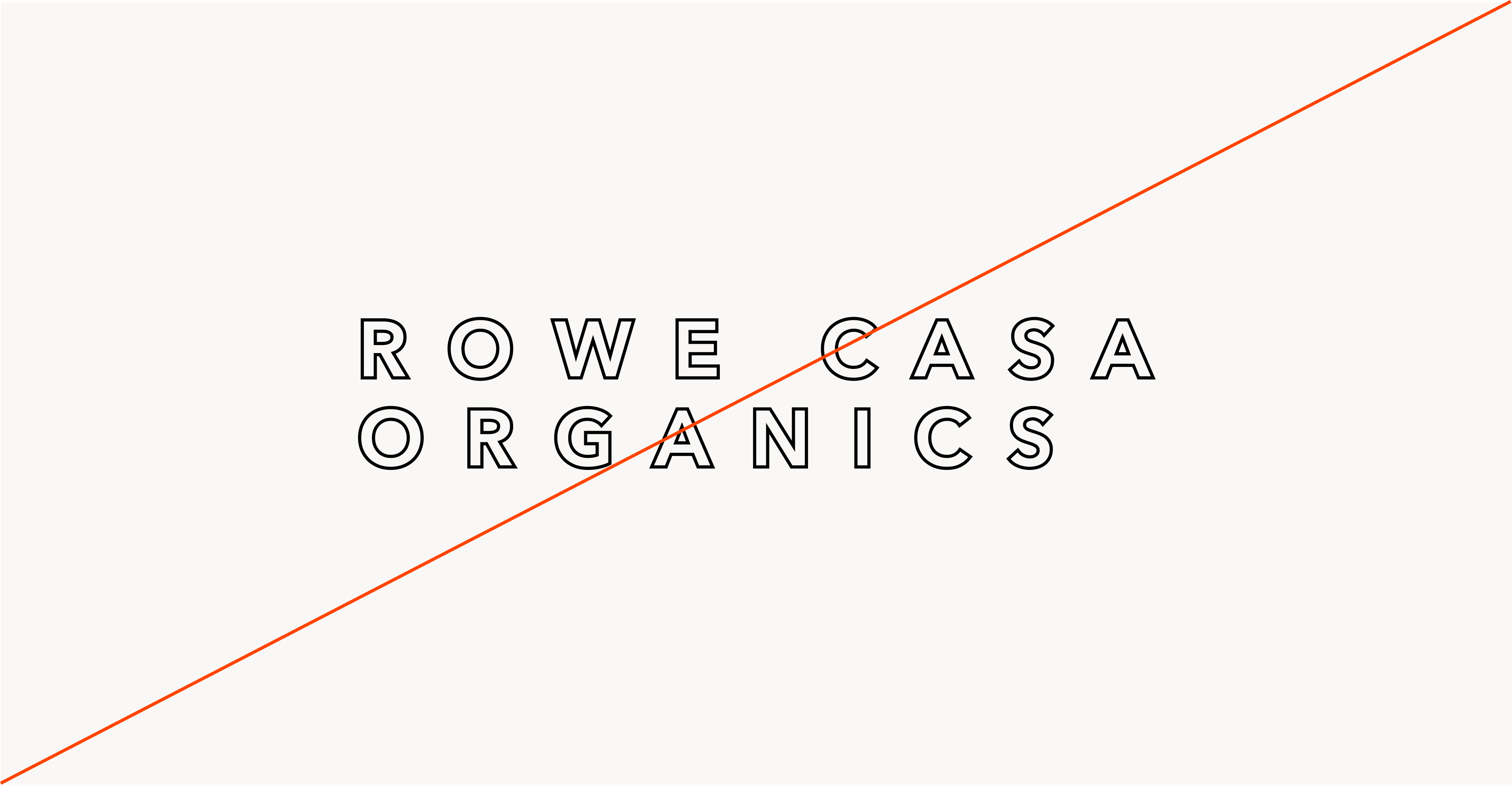
Do not outline the logo
Do not realign the lockup
Do not add gradients the logo
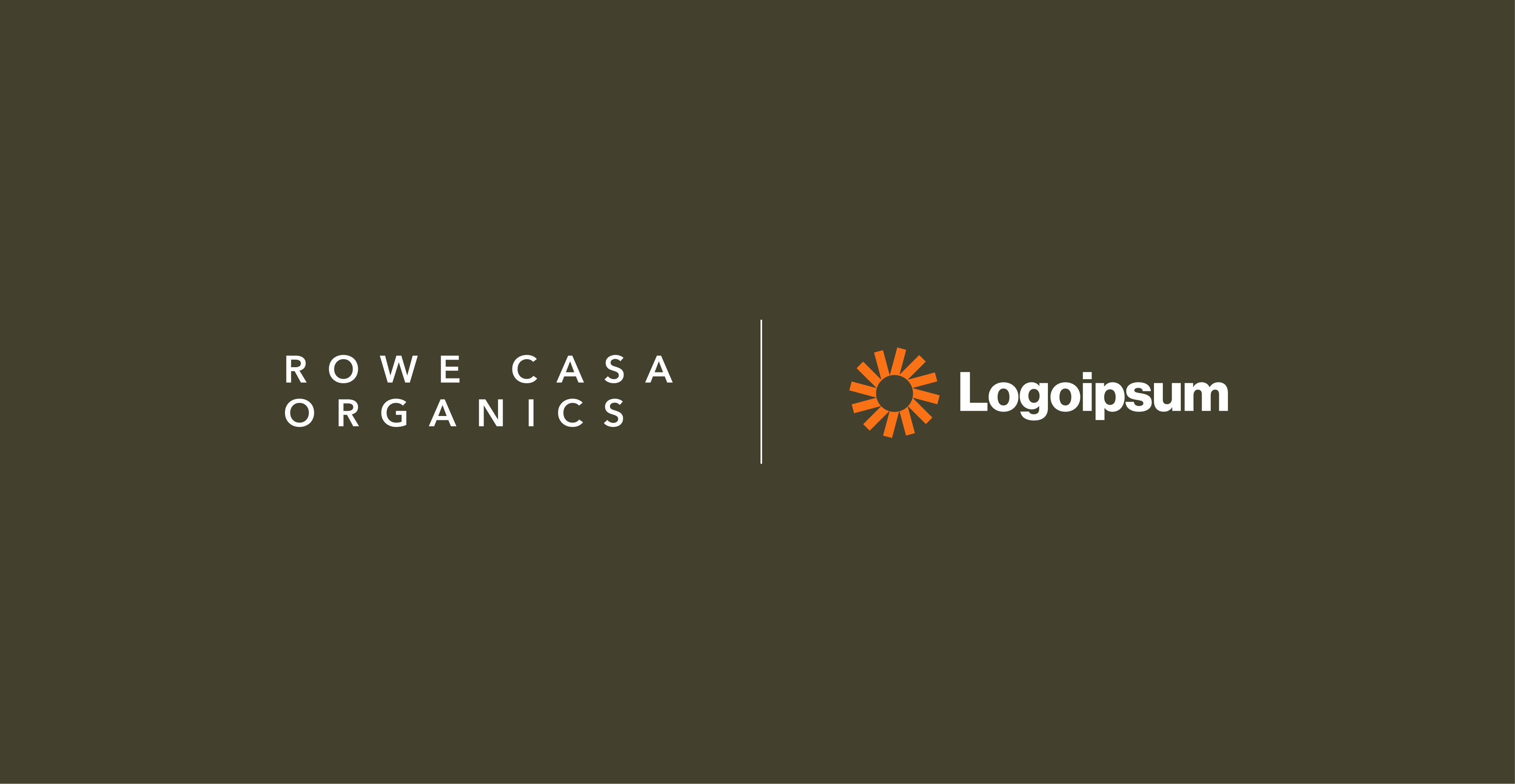
Partnerships
Typography
Rowe Casa Organic’s typography balances clarity and professionalism with a modern yet timeless type pairing, reinforcing our commitment to accuracy, efficiency, and financial stability.
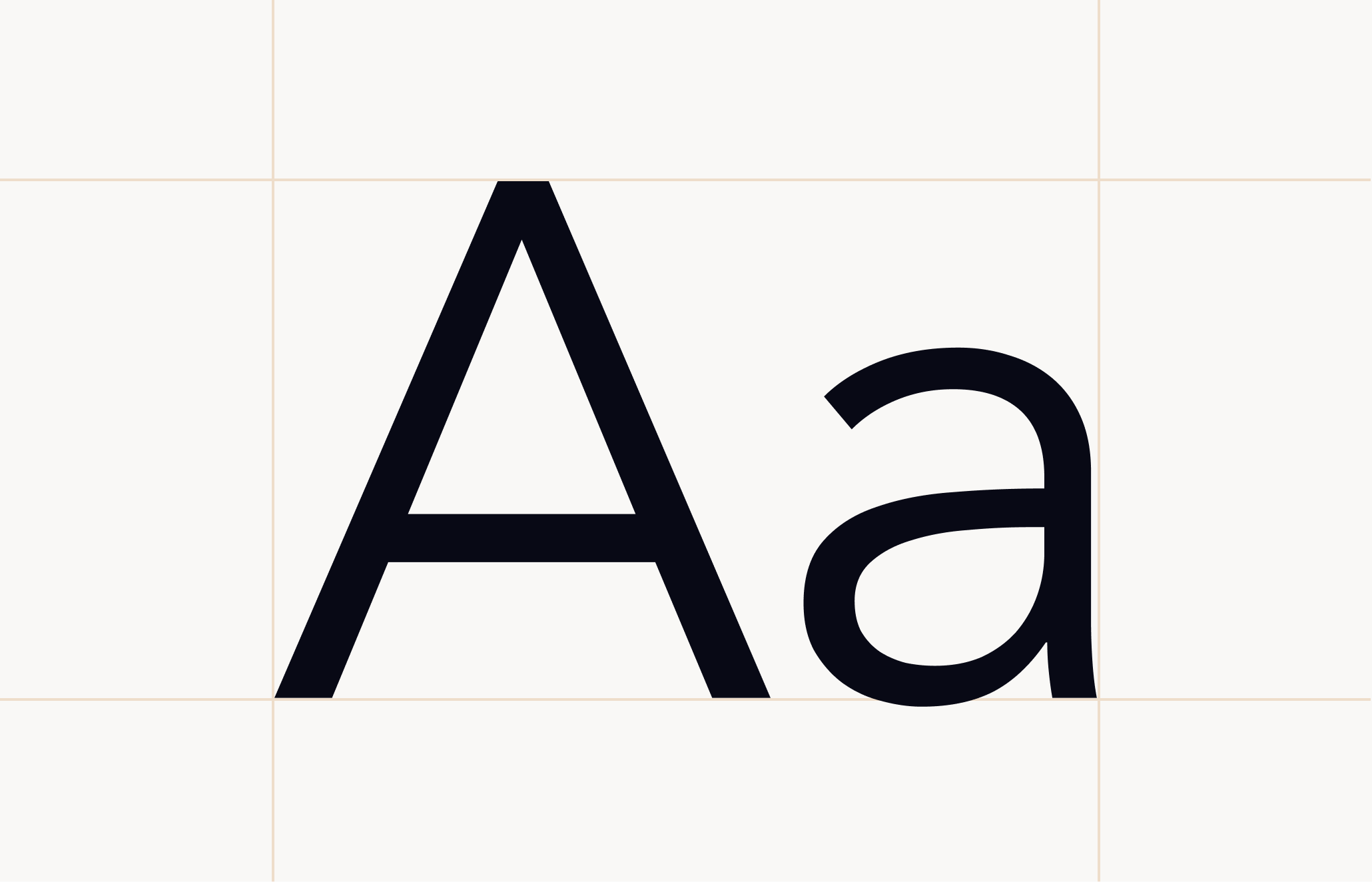
Primary Sans-Serif (Avenir Next Reg) is a clean, modern sans-serif typeface that ensures legibility and precision across all digital and print materials. Its geometric structure reflects clarity, efficiency, and trust, making it the ideal choice for content, packaging, and user interfaces.
Secondary Serif (Big Caslon) is a refined, authoritative serif font that adds a touch of tradition and credibility. Used for emphasis in headlines, reports, and documents, it reinforces Rowe Casa Organic’s expertise and reliability.
This sans-serif and serif combination creates a dynamic contrast—modern yet trustworthy, professional yet approachable - ensuring Rowe Casa’s brand communication is dependable.
Primary Typeface
Avenir Next
Secondary Typeface
Big Caslon
NOTE:
Not all browsers and email providers support these fonts. The approved web-safe font to use in this scenario would be Helvetica in place of Avenir Next
Sizing
Typeface sizing is designed to create clarity and calm at every scale. Larger sizes are used intentionally to introduce key ideas and establish confidence, while supporting sizes maintain comfortable readability without visual strain. Spacing and hierarchy work together to reduce noise and guide the reader naturally through the content.
Natural Products You Can Trust
Type Sizes > 60+pt/px
110% Leading
-2% Tracking
We are on a mission to provide clean, non-toxic, high quality, and completely natural and effective products.
Type Sizes 55–60pt/px
110% Leading
-2% Tracking
We are constantly pursuing the best ingredients found in nature along with working alongside organic chemists and third-party testers to ensure maximum potency, efficacy, and quality with every ingredient and product.
Type Sizes 24–55pt/px
120% Leading
-1% Tracking
We are on a mission to provide clean, non-toxic, high quality, and completely natural and effective products. We are constantly pursuing the best ingredients found in nature along with working alongside organic chemists and third-party testers to ensure maximum potency, efficacy, and quality with every ingredient and product.
Type Sizes 0–24pt/px
140% Leading
-1% Tracking
Color
The Rowe Casa Organics color palette is designed to feel calm, grounded, and trustworthy across every touchpoint.
Rooted in natural, muted tones, the palette reflects the simplicity and integrity of the ingredients we use and the care we bring into every product. Soft neutrals create space to breathe, while deeper earth tones provide contrast, clarity, and visual hierarchy without ever feeling harsh or overwhelming.
Color is used with intention, never decoratively. It supports clarity, reinforces confidence, and allows products, photography, and content to take the lead. Lighter tones provide openness and balance, while richer hues are reserved for structure, emphasis, and distinction.
This restrained approach ensures the brand feels consistent, elevated, and reassuring wherever it appears, helping families focus on what matters most, understanding the product, trusting the brand, and making confident choices for their home.
Primary Pallette
Print + Digital
MenS
HEX: 25282a
PANTONE 426 c
CHRISTMAS CHEER
HEX: 492426
PANTONE 2449 c
HAIR CARE
HEX: 4d4933
PANTONE 7771 c
WELLNESS
HEX: 393d46
PANTONE 4140 c
Pumpkin Spice
HEX: bd9979
PANTONE 2316 C
PET CARE
HEX: ab9071
PANTONE 4256 C
OUTDOOR
HEX: 5f4b3c
PANTONE 7519 c
HOUSEHOLD
HEX: 8d8173
PANTONE 4225 C
SKINCARE
HEX: d6d1c3
PANTONE 7527 C
CONSUMABLES
HEX: d7d1ca
PANTONE Warm Gray 1 C
HORMONE
HEX: 947866
PANTONE 4725 C
Secondary Palette
Print + Digital
Unscented Grey
HEX: #D7D2CB
PANTONE Warm Gray 1 C
Vanilla Mint
HEX: #BDA594
PANTONE 4248 C
Coffee + Vanilla
HEX: #A58D7A
PANTONE 7530 C
Himalayan Salt +
Frankincense
HEX: #A98B76
PANTONE 4049 C
Charcoal + Oatmeal
HEX: #7D6753
PANTONE 7531 C
Bronzing
HEX: #6A4E3B
PANTONE 7519 C
Rosemary +
Lemongrass
HEX: #6C6030
PANTONE 7770 C
Tea Tree + Lemongrass
HEX: #5F5D3E
PANTONE 4228 C
Cucumber + Lime
HEX: #59592F
PANTONE 7764 C
Spearmint + Eucalyptus
HEX: #544C32
PANTONE 7771 C
Vanilla + Cocoa
HEX: #5B4528
PANTONE 7554 C
Pumpkin Spice &
Orange Ylang
Ylang Tan
HEX: #C69C74
PANTONE 2316 C
Bergamot + Grapefruit
HEX: #B68675
PANTONE 4725 C
PET CARE
HEX: ab9071
PANTONE 4256 C
WELLNESS
HEX: 393d46
PANTONE 4140 c
Pumpkin Spice
HEX: bd9979
PANTONE 2316 C
Bakuchiol +
Frankincense
HEX: #6A3018
PANTONE 4625 C
Rose + Jasmine
HEX: #5C2028
PANTONE 2449 C
Lavender + Chamomile
HEX: #66666A
PANTONE 4195 C
PET CARE
HEX: ab9071
PANTONE 4256 C
WELLNESS
HEX: 393d46
PANTONE 4140 c
Pumpkin Spice
HEX: bd9979
PANTONE 2316 C
Favicon
Rowe Casa’s favicon is a refined expression of our brand mark, designed for clarity at the smallest scale. It must remain bold, simplified, and instantly recognizable across browser tabs, bookmarks, and mobile interfaces. Fine details should be minimized to preserve legibility, and contrast should be strong to ensure distinction against both light and dark system environments. The favicon serves as a subtle but consistent brand signal wherever our digital presence appears.


Iconography
Rowe Casa’s iconography is simple, clear, and purposeful. We use the Phosphor icon library on the website to ensure consistency and clarity across experiences. Icons should maintain sufficient line weight to remain legible at small sizes, while avoiding unnecessary detail that can become muddy when scaled. The goal with our iconography is to quietly support our content and identifiers.

Photo Direction
Rowe Casa’s photography builds trust through clean, grounded visuals that feel calm, human, and intentionally composed.
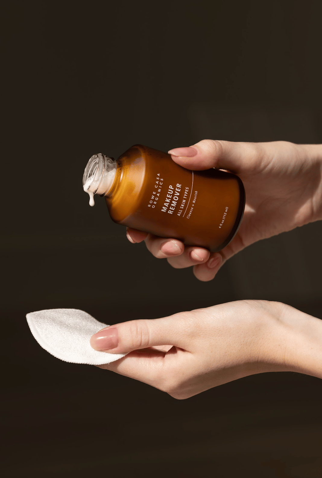
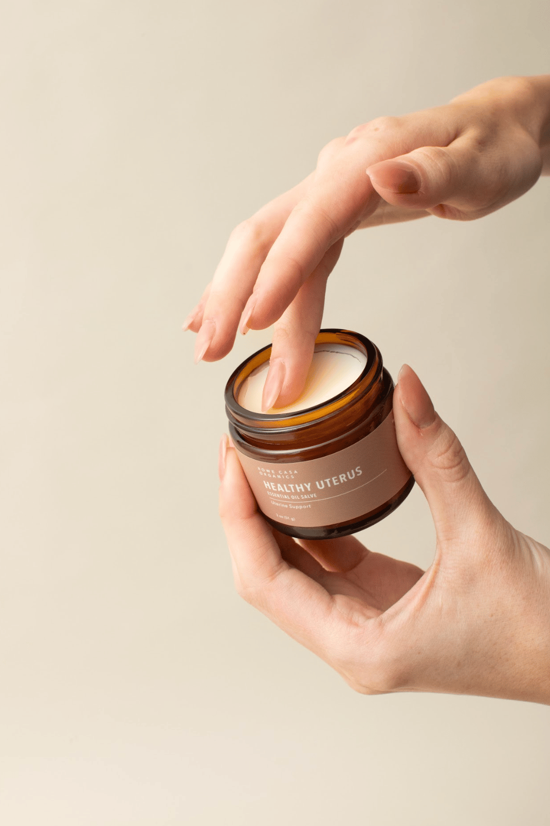
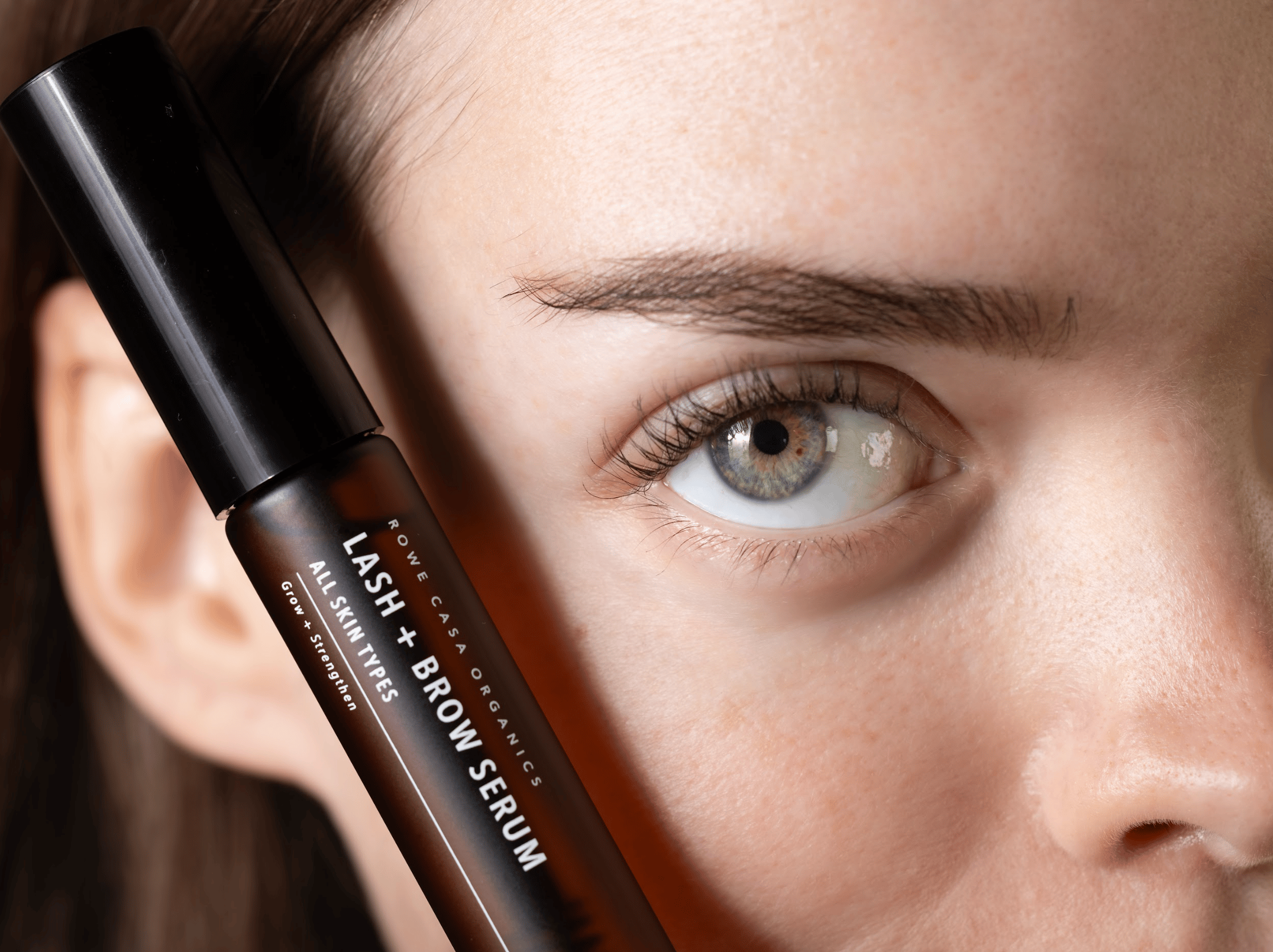
Product Shots
Photography should be modern, well-lit, and clean, with a clear focus on the product or its use. Avoid clutter and overly dramatic compositions.
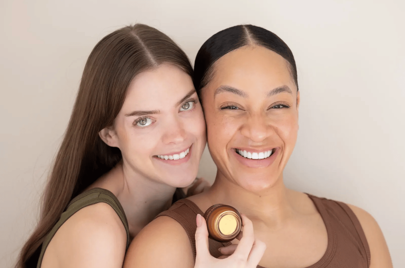
Portraits
Images should capture warm, real-world feel, and emotion. The subject and the product being used should be crisp and vibrant.
Design Principles
Our design choices reflect who we are, what we value, and how we want our customers to feel. These principles guide every touchpoint — digital, physical, and experiential — ensuring a cohesive, authentic brand presence.
Natural & Authentic
What it means
Materials, colors, textures, and visuals should feel organic and unprocessed — reflecting the purity of our products.
Why it matters
Authenticity builds trust with our audience.
How to apply
Avoid overly glossy, artificial, or trendy effects. Favor earthy tones, real textures, and honest imagery.
Warm & Inviting
What it means
The brand should feel approachable, friendly, and human.
Why it matters
We want customers to feel welcomed and cared for, not overwhelmed or intimidated.
How to apply
Use open layouts, soft contrasts, and imagery that evokes comfort and connection.
Minimal & Purposeful
What it means
Every element has a reason for being; nothing exists without intention.
Why it matters
Clarity makes the brand feel premium and professional while keeping the focus on the product.
How to apply
Embrace whitespace, simple typography, and clear hierarchy. Remove anything that doesn’t support the core message.
Timeless & Responsible
What it means
Design should feel enduring, not tied to fleeting trends, and reflect sustainability values.
Why it matters
Timeless design communicates quality, thoughtfulness, and environmental responsibility.
How to apply
Choose balanced layouts and sustainable production methods (materials, printing, packaging).


